I hope you all are having a GREAT summer! I’ve been on a super creative streak and loving it! I’m finding that taking part in card “challenges” helps me to get focused and accomplish my goal of completing at least one card a day, which I hope to do because I know we will be taking some days off here and there for camping. Speaking of which, my husband and I took a day off yesterday to take our vw van (Seb, yes, it has a pet name) for some re-repairs (a faulty part so no charge whew!) While we waited for the repairs we went on a three hour hike, up and down Giant’s Head Park in Summerland. Quite the little workout for our legs but well worth it for the view.
Yep, that’s my man – he makes any backdrop pale in comparison!
It was a fun day away, and I got to visit the thrift store in Summerland. I’d rank it as #2 on my list of favourite thrift shops because it benefits charity, it has a terrific selection – always and the prices are excellent. We also had lunch out and grocery shopped and did not get home until dinner time but I made myself mojo no matter what.
So here is the sketch for Mojo No 202:

Won’t YOU join in the Mojo Challenge?
I must confess that I was daunted by this sketch, don’t quite know why, but I jumped in headlong, working my way out from the center of interest – the circle, and somehow it all came together in the end.
My photo does not do justice to the pretty paper. I took this photo in the outdoor and I think the light affected the look – not exactly sure how to adjust it but its not too far off from reality.
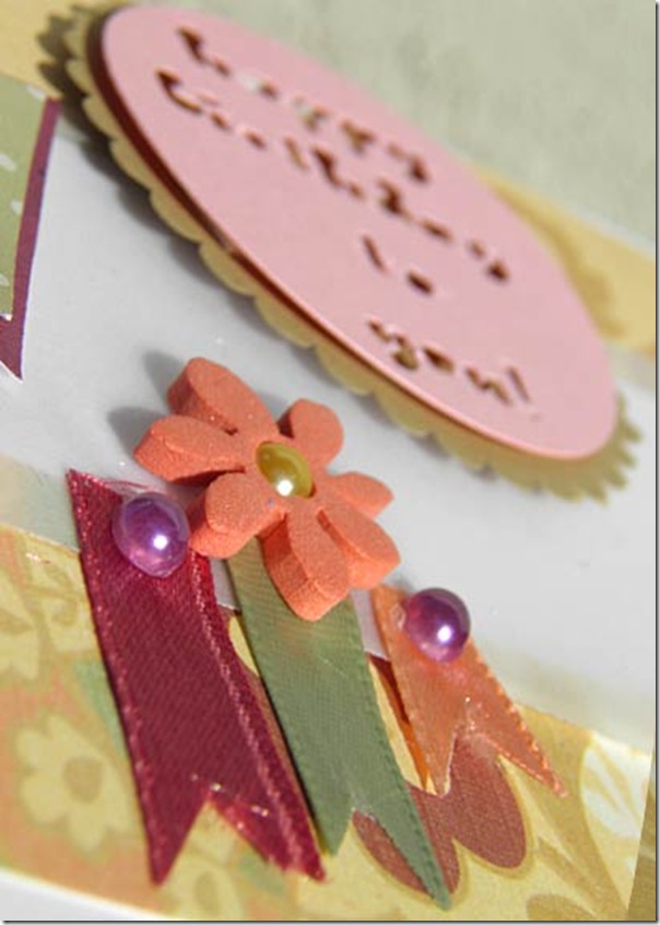
I’m sorry to say that I did not stamp my greeting because of two reasons. The first is that I did not have a birthday greeting stamp I felt would “fit” with my card and the second reason is that I am in ♥ with my new Silhouette SD and use any excuse at all to make it jump hoops for me until I have mastered it. So I cut the greeting out of pink cardstock, then layered it over another scallop edged circle. I used a plain piece of white cardstock underneath another vellum layer for the center of my card. Next I cut the two “flags” from a polka dot pattern paper, backed by slightly larger burgundy paper – both anonymous scraps in my collection. The final touches to complete my card were the three ribbons – again repeating colors in my base paper and then the simple foam sticker (Creatology for ages 3+ – I’m definitely that haha – and I paid 25 cents for the entire box at a yard sale) After staring at my card through slitted eyes (sorta fuzzes it all and then I can see where I need to fix or add – artists do this with their paintings all the time, believe it or not!) I then embellished the ribbons and flower with pearls. Voila!
And now I will share one of my 365 Card – I’m waayyy behind, have a few completed but backed up on my computer. I will blog these over the coming days so I don’t overwhelm anyone.
Here is a picture of Manoli’s creation – she challenged us to:
”This one requires you to add paint to the background. You can do this any way you want and in any amount.”
And I must confess that I was tempted to skip over this one because I looked at it and thought “hmmm – work and time” and wasn’t sure I wanted to invest much of either until my Mr’s voice rang in the back of my head reminding me that my strength has always been my artistic talent. So I decided to bite the bullet and just go for it. Here is what I decided to create – along with a tutorial!
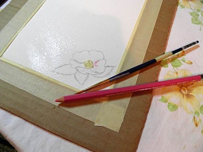
I tore a sheet of 140 lb arches watercolor paper to the full size of my greeting card (5.5 inches by 4.24) I taped it onto a piece of cardboard using masking tape. This is done so that when the watercolor paper takes liquid the tape will prevent the paper from buckling and also will allow it to dry flat.
Next I sketched in this wild rose. I use a mechanical pencil – its always sharp and precise (I can never find a pencil sharpener when I need one also!)
I placed a smidge of scrunched-up masking tape in the center of the flower because I don’t want paint in this area. Watercolour is more difficult than other types of paint (eg: acrylics or oils) because you must leave the white of your paper for lighter areas – with oils or acrylics you simply brush white paint overtop of the areas you want painted white. This said, watercolour is my favourite medium (besides plain old pencil and paper which is the basis of any good artwork!) I like watercolour because it “moves” and it shifts and blends in with other colours and reacts with them. I think of watercolour like I think of cats – you can control watercolour to a certain degree but there’s always the element of surprise with it – many, many times a successful painting has been created from a “happy accident” with watercolour paint.
With the masking tape in place (and I could have used masking fluid for this as well, but this was quicker) Next, I spray the paper lightly with a fine mist of water. I am doing this deliberately because I want to have a bit of a “bleed” of the color.
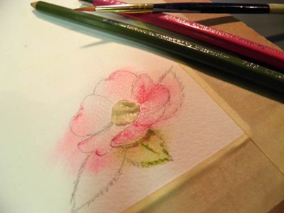
Then I start (watercolour) penciling in an olive green and crimson to begin defining both the rose and leaves. I pencil, then “drag” the paint around using a lightly water-charged brush.
After working with another darker green and then defining the center of the blossom with a pale green area, surrounding it with a circle of warm yellow – the final touch is to use a fine tipped felt to make the little stamen. And there you have it!
I’m going to place the blossom below this paragraph – just click on the picture to be taken to the download - the full size (3 inches) jpg @300 dpi. Feel free to use my blossom in your projects. Please credit me and link to my blog if you use my image – and I would ♥ to see how you use it
And how did my card turn out?
I like it! I created a corner cut out template and cut it using my Silhoette SD. I think I “nipped” the corners manually though, because I thought they look better rounded. I also designed the dark green tag shape as well too – I will post them both below for your use – both in png format and in .studio for my fellow Silhouette SD users. Enjoy – again, please, no pirates … if you want to share my files with friends, please have them come here themselves and scoop the goodies, and a comment would be very appreciated!
And YOU might want to join in and try a card – a – day over at the 365 blog too!
Barb Derksen’s Corner Cut Template
download (.studio)
Barb Derksen’s Damask Tag
download (png)
download (.studio)


awwww beautiful..you got that machine doing everything ..and doing it beautifully ...way to go ...love your 365 day card challenge ..that is so awesome . Still trying to get that time to do a card soon ...maybe tonight after the girls go to bed.
ReplyDeletehugs
Good afternoon Barb:)
ReplyDeleteLOVE your pic of Miles and he really does pale the background.:)
Your card is so CUTE.!! I never know what to expect when I come to your blog.You find the neatest things at the thrift stores too!!!
You did a FANTASTIC job on your watercolor flower. I LOVE it!! AWESOME!!:)Thank you so much for sharing it with me.!! Thanks also for the COOL templates too. I am still waiting for the delivery of my machine..and my back to get better so I can play.:)
Love,
Valinda
thought I had been here and left a comment ...but I guess not ...wow do I love your cards ....that second card is beautiful Barb...you did an awesome job paint the rose...wow. Well have a great Friday.
ReplyDeleteYour watercolor flower is amazing! Thanks for shairng the pics of the stpe by step - I didn't know my watercolor pencils could do all that!
ReplyDelete